本文通过三种方法给大家介绍了基于css实现的页面的尖角、小三角、不同方向尖角效果,代码简单易懂,非常不错,具有参考借鉴价值,需要的朋友参考下吧,需要的朋友可以参考下。
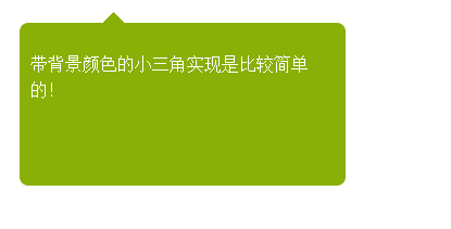 方法一效果图-解决网
因为有背景,所有实现起来比较方便,尖角的内部同个颜色就可以不用考虑遮挡问题
html:
<div id="first">
<p>带背景颜色的小三角实现是比较简单的!</p>
<span id="top"></span>
</div>
CSS:
#top { position: absolute;
width: 0px;
height: 0px;
line-height: 0px;/*为了防止ie下出现题型*/
border-bottom: 10px solid #89b007;
border-left: 10px solid #fff;
border-right: 10px solid #fff;
left: 76px;
top: -10px;
}
#first { border-radius:8px;
-moz-border-radius:8px;
-ms-border-radius:8px;
-o-border-radius:8px;
-webkit-border-radius:8px;
position: absolute;
height: 150px;
width: 300px;
background: #89b007;
left: 22px;
top: 33px;
}
#first p{padding:10px;
line-height:1.5;
color:#FFF;
}
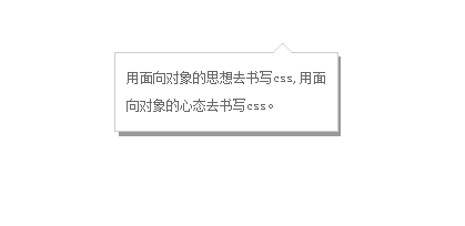 方法二效果图-解决网
html:
<div class="w">
<div class="x">
<p><a href="#">用面向对象的思想去书写css,用面向对象的心态去书写css。</a></p>
<span class="z">◆</span> <span class="y">◆</span>
</div>
</div>
CSS:
* { margin: 0;
padding: 0;
}
a{ color:#666;
text-decoration:none;
line-height:25px;
text-indent:24px;}
.w{ width:200px;
position:absolute;
background:#999;
left:400px;
top:200px;
font-size:12px;
text-align:left
}/*模拟灰色阴影背景层*/
.x{ width:180px;
position:relative;
background:#fff;
border:1px solid #ccc;
padding:10px;
left:-4px;
top:-4px;
}/*内容div*/
.y , .z{ position: absolute;
left: 141px;
}
.y{ color: #ccc;
font-size: 19px;
top:-12px;
z-index:1;
}/*模拟小三角*/
.z{ color: #fff;
font-size: 19px;
top:-11px;
z-index:3;
}/*模拟小三角*/
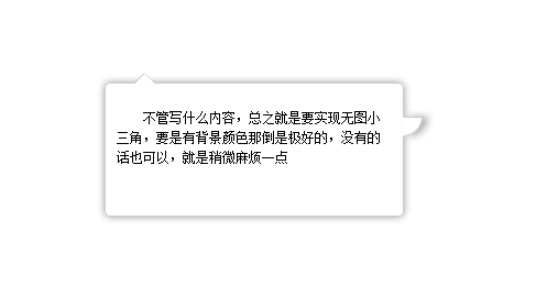 方法三效果图-解决网
html:
<div id="content">
<span class="out"></span>
<span class="iner"></span>
<span class="right"></span>
<p>不管写什么内容,总之就是要实现无图小三角,要是有背景颜色那倒是极好的,没有的话也可以,就是稍微麻烦一点</p>
</div>
CSS:
#content {
text-indent: 2em;
box-shadow: 0px 0px 10px #999;
padding: 10px;
font-size: 12px;
line-height: 1.5;
border-radius: 5px;
height: 100px;
width: 250px;
position: relative;
margin: 200px auto;
border: 1px solid #CCC;
}
span {
position: absolute;
left: 25px;
height: 0px;
width: 0px;
}
/*上部小三角实现样式开始*/
span.out {
line-height: 0;
border-width: 10px;
border-color: transparent transparent #CCC transparent;
border-style: dashed dashed solid dashed;
top: -20px;
}
span.iner {
border-width: 10px;
border-color: #fff transparent #FFF transparent;
border-style: dashed dashed solid dashed;
top: -19px;
line-height: 0;
}
/*右部小三角实现样式开始*/
span.right {
background: #FFF;
border-width: 1px;
width: 16px;
height: 16px;
border-color: #CCC #CCC transparent transparent;
border-style: solid solid dashed dashed;
left: 270px;
top: 30px;
border-radius: 0 0 100% 0;/*这里radius的值不要选取绝对值因为在放大或者缩小的过程中会产生封不住口的现象*/
line-height: 0;
box-shadow: 5px 0 10px #aaa;
}
按字母顺序浏览:A B C D E F G H I J K L M N O P Q R S T U V W X Y Z
→我们致力于为广大网民解决所遇到的各种电脑技术问题 如果您认为本词条还有待完善,请 编辑词条
上一篇Div+Css画圆代码
下一篇CSS 美化搜索框代码


